
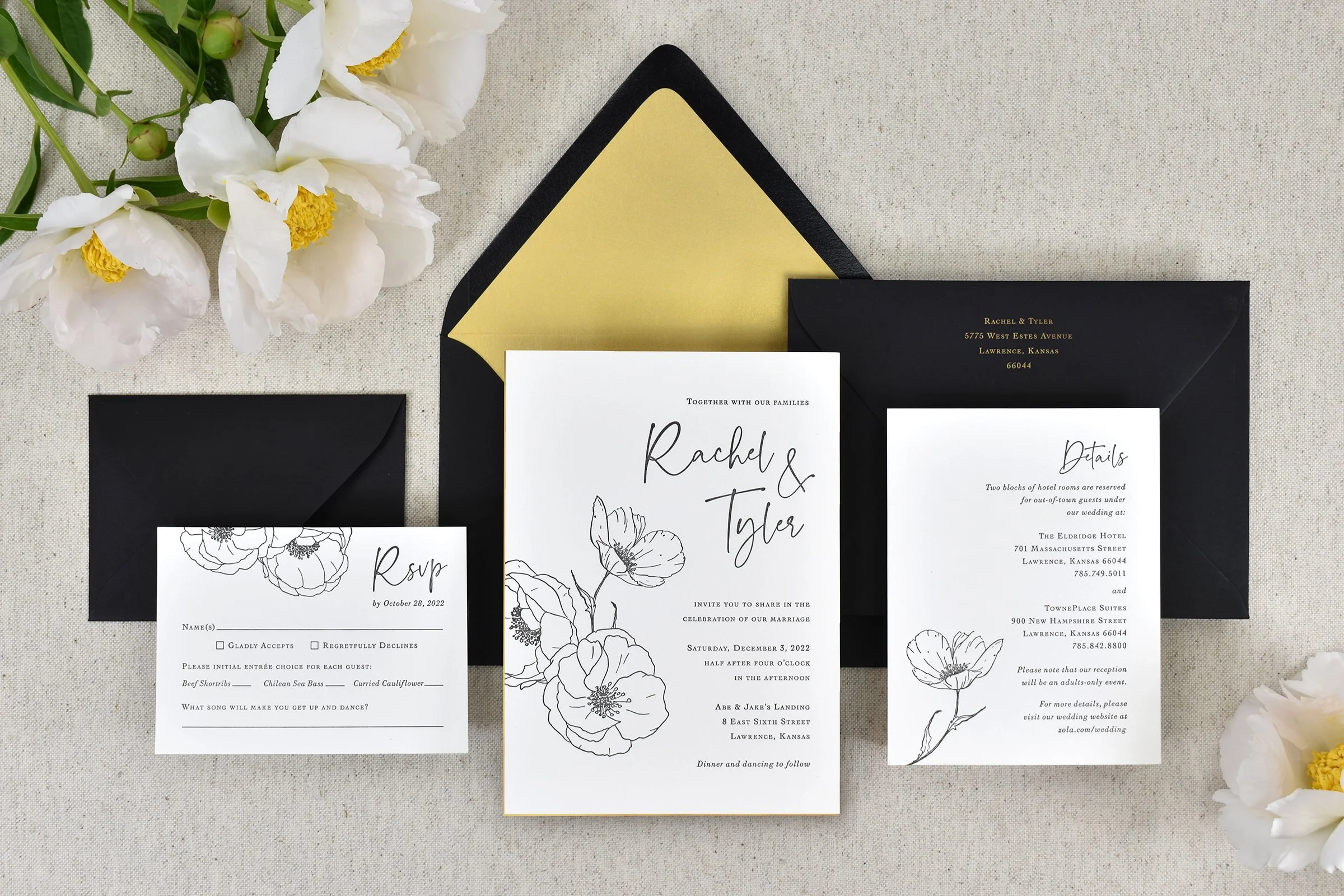
Rachel & Tyler
Rachel & Tyler’s wedding color palette was black and white, with surprise gold accents, which I painted on the edges of the invitations and used for the envelope liner. Their florals included white anemones, which I included on the cards.
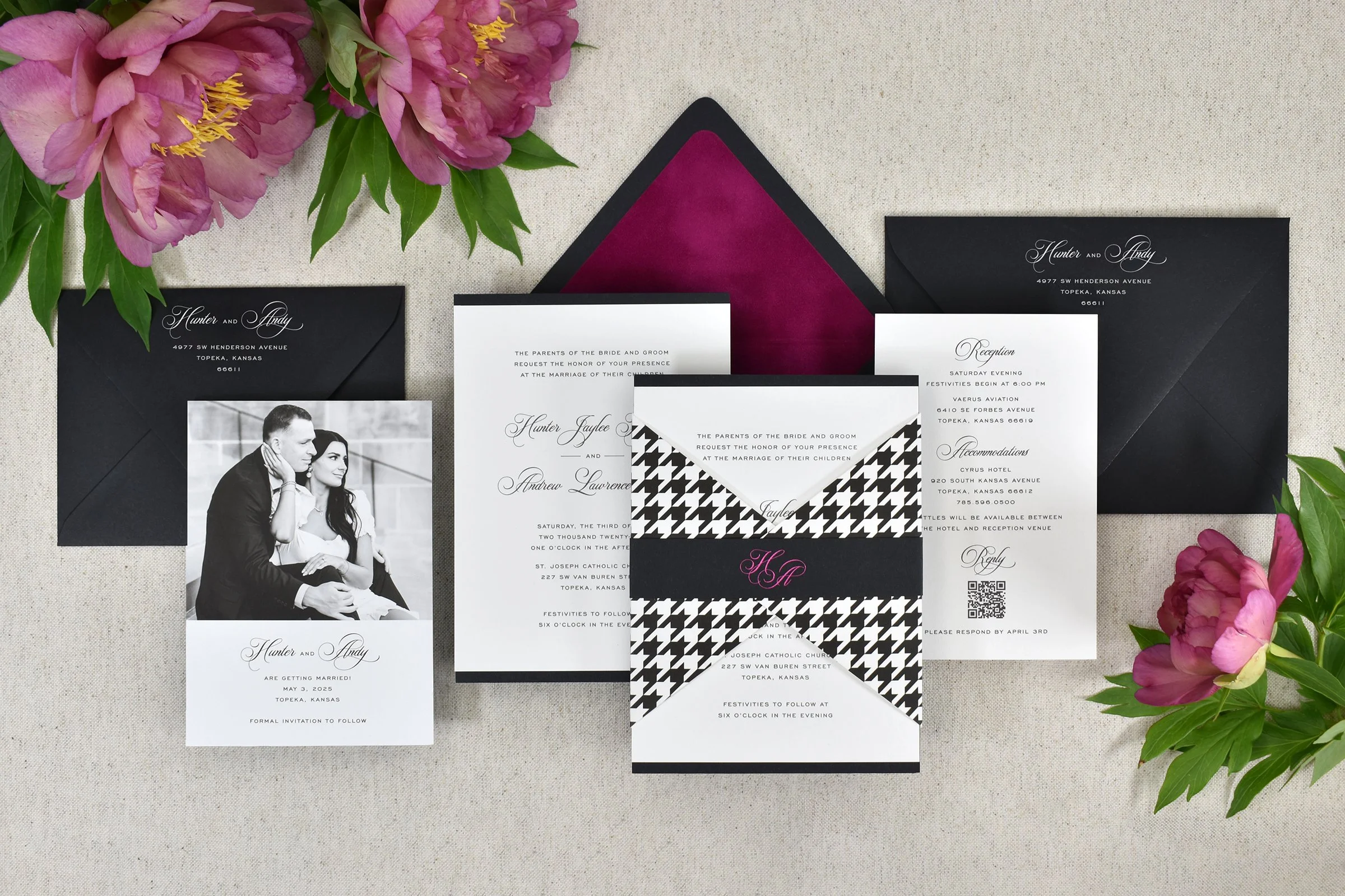
Hunter & Andy
This couple’s theme was black and white houndstooth combined with metallic hot pink details. The invitation was wrapped with a custom diecut bowtie shape and a belly band, and the black inner envelope was lined in fuchsia velvet.

Sophie & Kieran
Sophie hails from Kansas and Kieran is from Scotland, so I drew a bouquet of sunflower and thistles for their custom letterpress-printed invitations. They are printed on a textured but very soft and thick paper, and paired with kraft envelopes for a down-to-earth wedding style.
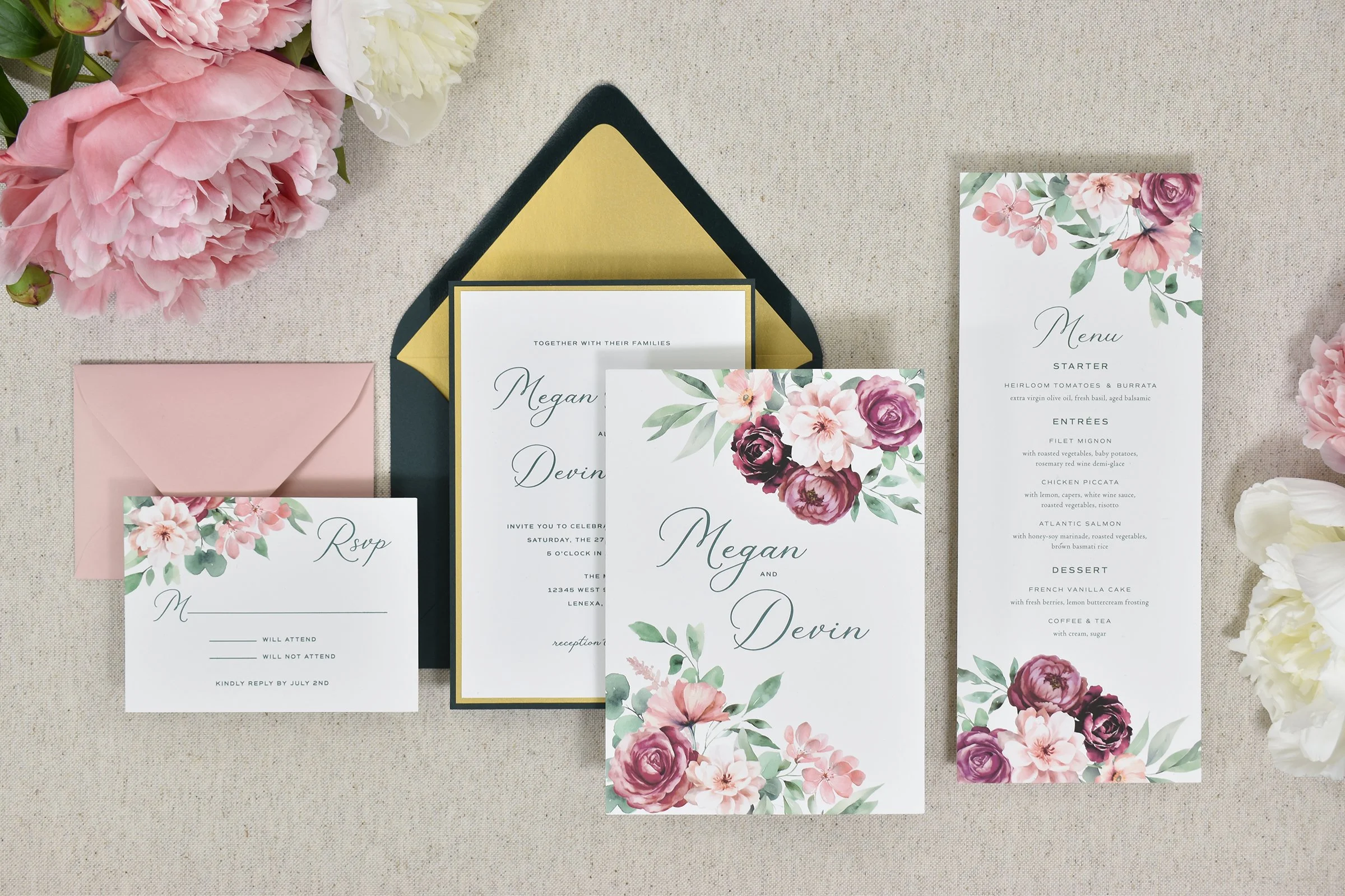
Megan & Devin
This invitation suite has a cover card with both digital and letterpress printing so the florals could be printed in full color. Underneath, the formal invitation is printed in letterpress and then backed with additional cards in metallic gold and hunter green to match the couple’s color palette.
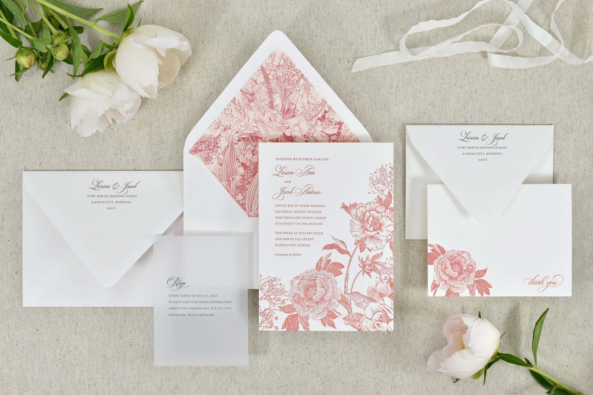
Larissa & Jacob
The couple requested a “profusion of flowers” for their wedding invitation suite, to match the florals planned for the wedding day. The reply info was included on a translucent vellum sheet and overlapped the invitation in the envelope, and the envelope liner also included coral flowers.

Carolyn & Jeffrey
The couple was married at an historic 1920s mansion in Kansas City, so I designed an invitation that reflected that era as well as their color palette of blue, green and gold. The letterpress invitation was printed on a cream-colored piece of paper that wrapped around a metallic blue and gold printed card.

Stephanie & Ryan
For their destination wedding in Ireland, I drew a Celtic-inspired set of intertwined initials for Stephanie and Ryan’s letterpress wedding invitations. Their invitations were printed on cream paper which was backed with green paper and printed with green, black and metallic gold inks.

Roseann & Steve
Roseann and Steve hail from either side of the pond, so they wanted a design that reflected their American and British nationalities. Their wedding flowers were English roses, so the invitation were sent with a cover card printed with roses, and the set was held together with a red and cream ribbon in the square envelope.
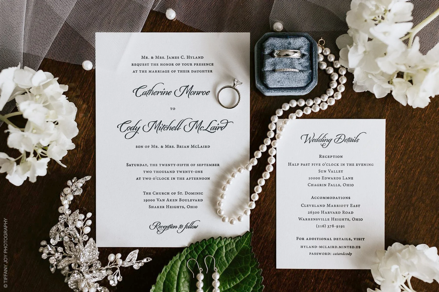
Cat & Cody
The couple was married in Ohio, and asked for a traditional invitation, letterpress-printed in dark navy ink on soft white paper.
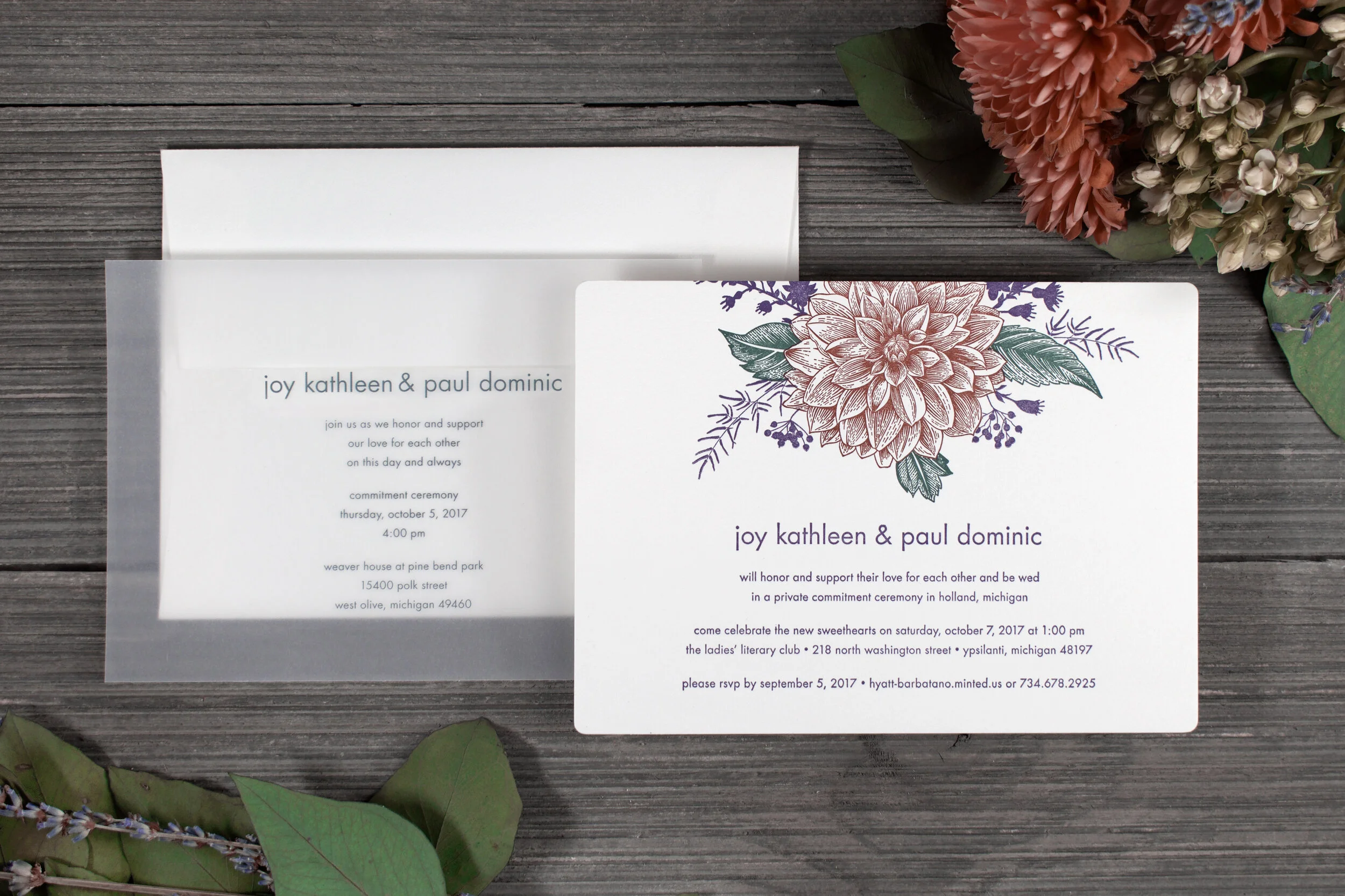
Joy & Paul
For Joy and Paul, we used floral elements that matched their wedding floral arrangements and their color palette. Since the ceremony itself was just for close friends and family, we included a translucent vellum insert with those details separate from the full invitations.
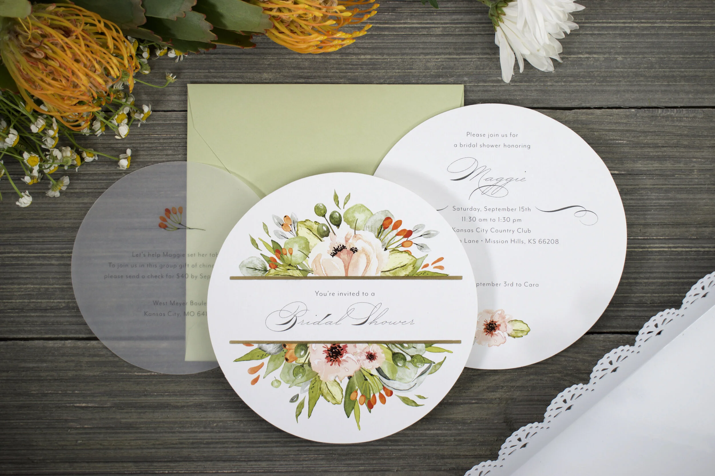
Maggie
I created circular diecut invitations for Maggie’s bridal shower, with translucent vellum inserts that accompanied the invitations in their square envelopes. These were digitally-printed in full color, and then printed with gold metallic ink on the letterpress.

Paige & Brian
The couple chose plum and cream for their color palette, and calla lilies for their wedding ceremony and invitation design. The invitations were number 10-envelope size, with a tall card inside the metallic purple envelopes.
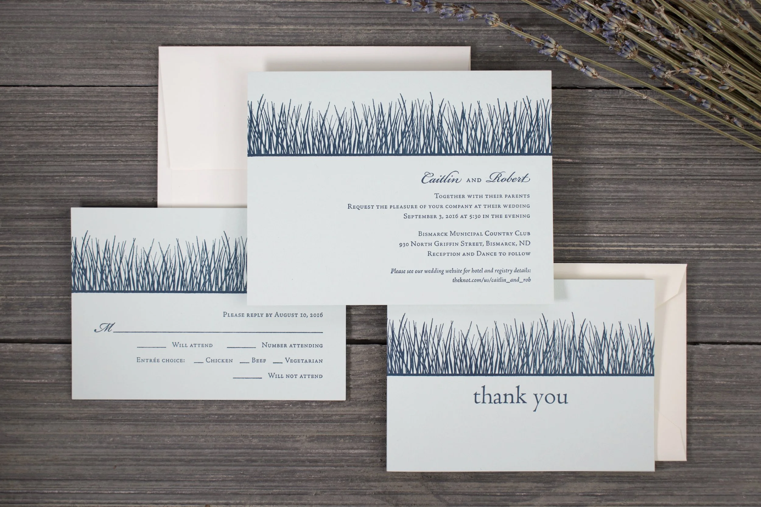
Caitlin & Robert
Caitlin and Robert’s color palette was navy blue and pale green. They were married in North Dakota, so I drew a grassy horizon for their letterpress-printed invitations, reply cards and thank you notes.
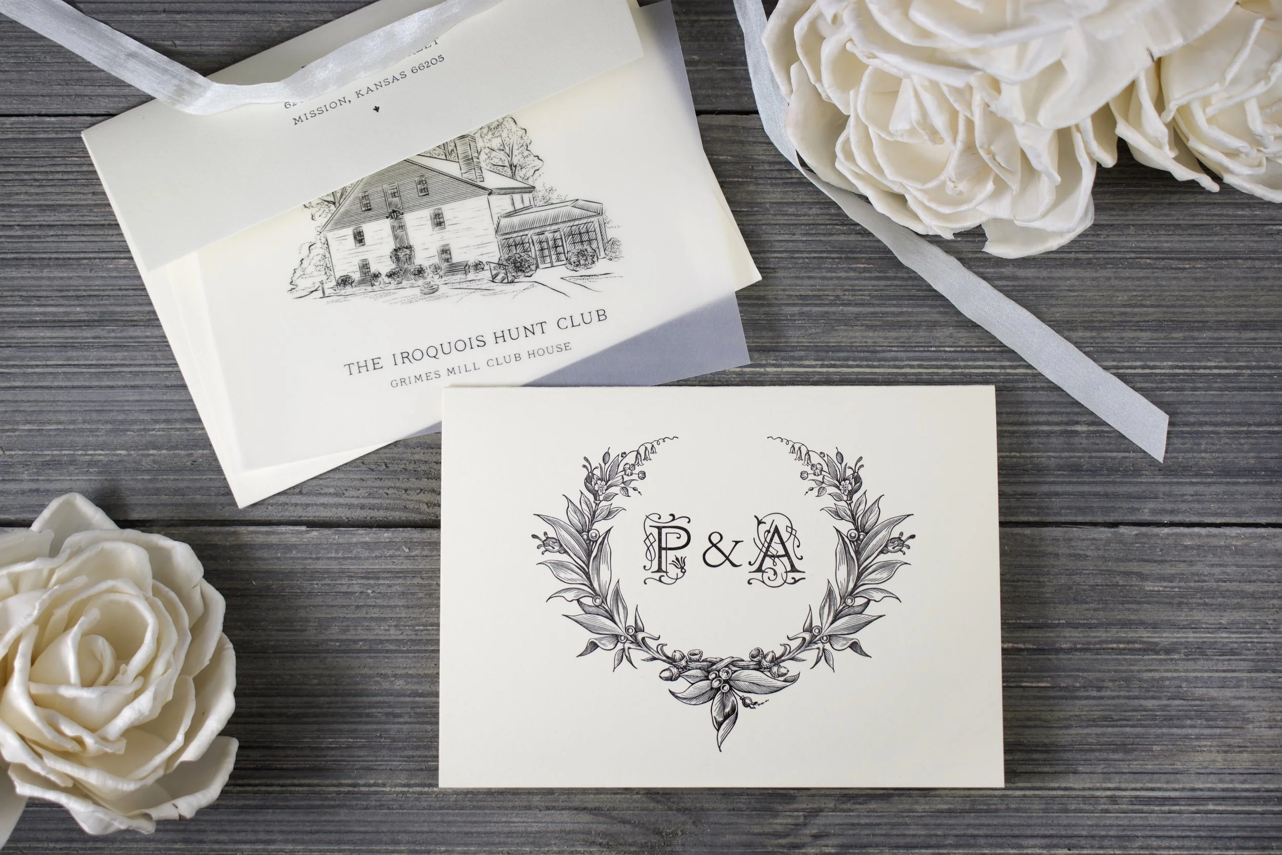
Pamela & Adam
Pamela and Adam’s rehearsal dinner took place at a historic location in Kentucky. I created a drawing of the location which was printed on translucent vellum and inserted inside the folded letterpress invitation.
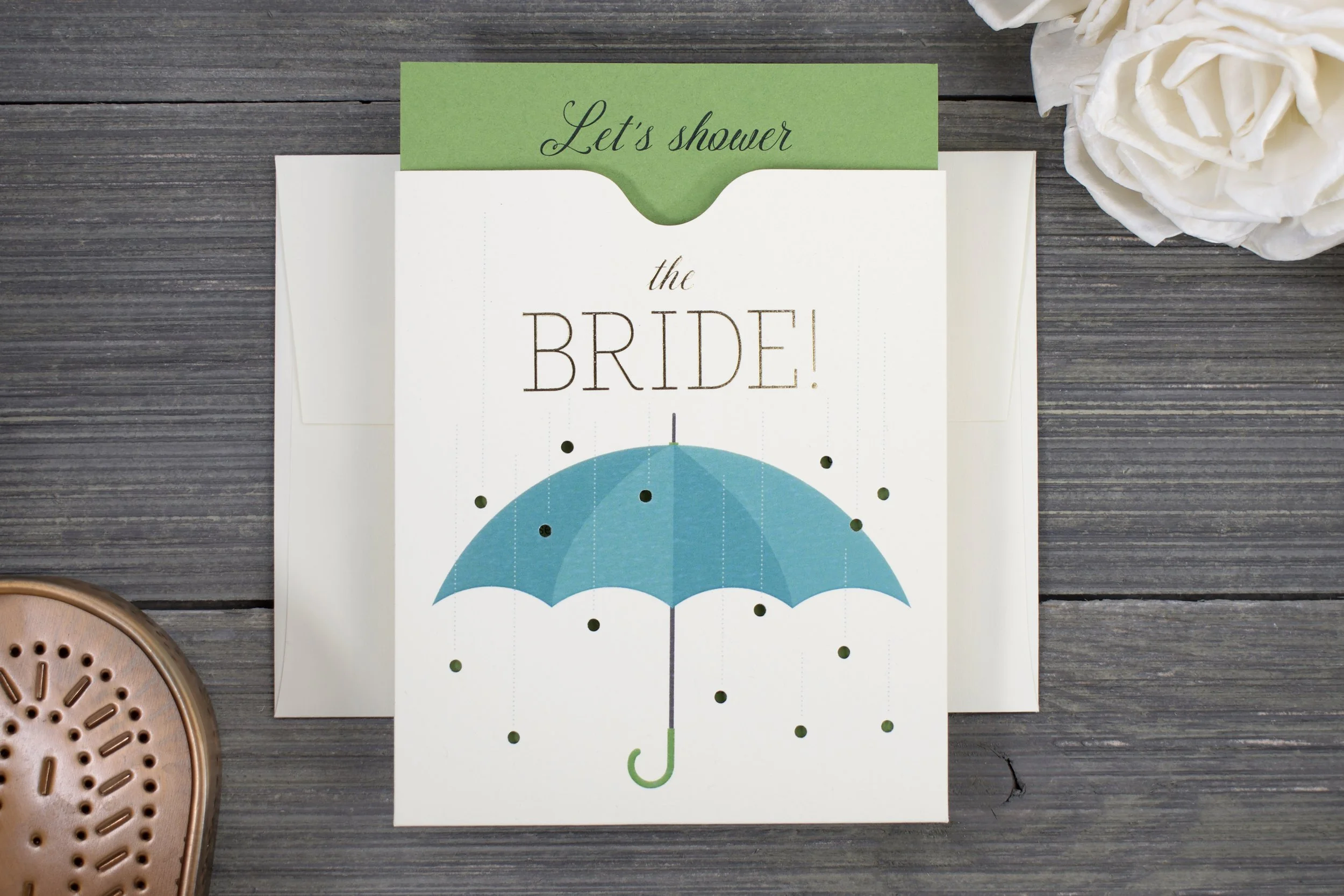
Aubrey
For Aubrey’s bridal shower, I created digitally-printed and gold-foil stamped enclosures with an insert that the recipient could pull out at the top to see the date, time and location of the party. The raindrops were holes drilled through the front of the enclosure, to catch glimpse of the card inside.